

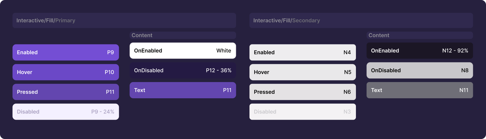
Overview of LaunchDarkly's design token color system.
The standard way to use colors in design systems
The common way to use color systems in companies is to establish a set of color guidelines that reflect the company’s branding and design standards. This typically involves creating a color palette with a specific number of colors that can be used consistently across all company materials, such as websites, marketing materials, product interfaces, and other design assets. The color guidelines may include specific color values (e.g. RGB, HEX, or HSL), as well as guidance on when and how to use each color in various contexts. For example, a company may define which colors are appropriate for primary branding elements versus secondary design elements, or which colors should be used for different types of buttons, links, or call-to-action elements. Design tools and software are used to manage and enforce the color system. This can include creating a library of design tokens or style guides that designers and developers can use, or using automation tools to enforce color standards across different projects and platforms.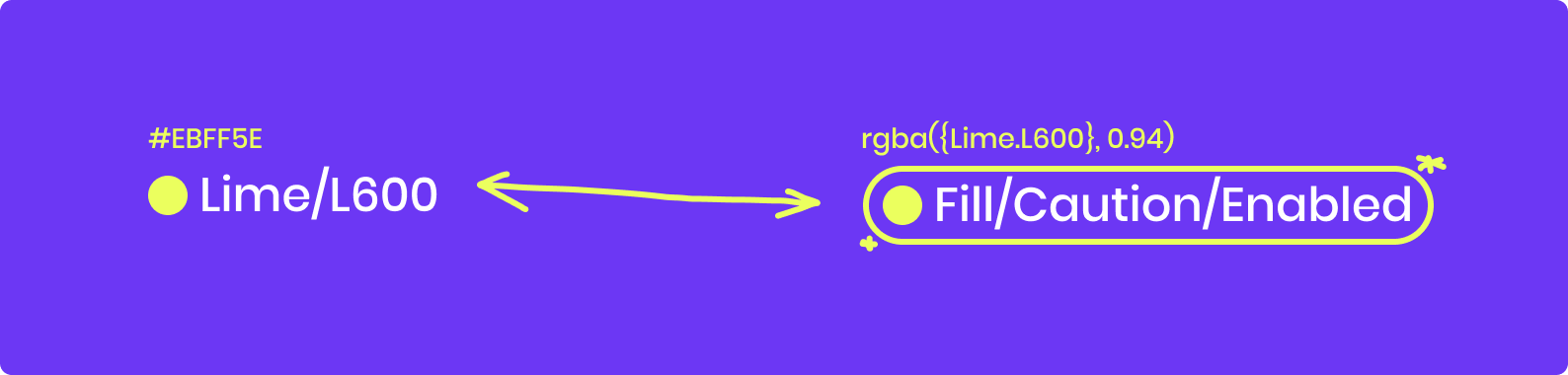
Example of a standard color palette used in design systems.
What are Design Tokens and what are their benefits
Design tokens are an essential tool for building scalable and consistent design systems. They are a simple and intuitive way to encapsulate design decisions and store them in a reusable and sharable format. Here are some reasons why design tokens are great:- Consistency: Design tokens promote consistency by providing a single source of truth for design decisions. They ensure that design elements such as colors, typography, spacing, and other design attributes are consistent throughout the design system.
- Efficiency: Design tokens save time and effort by allowing designers and developers to easily reuse design decisions across multiple projects and platforms. They eliminate the need for manual updates and reduce the risk of errors.
- Collaboration: Design tokens enable collaboration by providing a common language between designers and developers. They allow both teams to work together more efficiently and reduce the risk of misinterpretation or miscommunication.
- Flexibility: Design tokens provide flexibility by allowing designers to make changes to design decisions without affecting the underlying code. This means that changes can be made quickly and easily, without the need for extensive re-coding.
- Scalability: Design tokens allow design systems to scale by providing a framework for managing design decisions across multiple platforms and projects. This means that design decisions can be easily updated and shared, ensuring that the design system remains consistent and up-to-date over time.
How LaunchDarkly implements Design Tokens
When we set out to create our color set for design tokens at LaunchDarkly, we began by creating a foundational color scale. This involved selecting a range of neutrals, primary colors, and other colors that aligned with our brand identity. We used this foundational color scale as the basis for all of our design tokens related to color. After establishing our foundational color scale, we created a “Light Theme” to provide guidelines for using our lightest colors in different interface elements. This theme is focused on creating our default interface and includes guidelines for using our colors for text, backgrounds, and other elements inside the “Light Theme”. We also plan to create a “Dark Theme” to provide guidelines for creating a darker interface in the future. Using Tokens Studio we are able to create references to colors from our primitives library. This enables us to create color tokens, that stay true to their reference color. In the same time Tokens Studio helps us to sync all tokens with both Figma and our Codebase. Tokens Studio keeps our color system in sync, with no further development effort.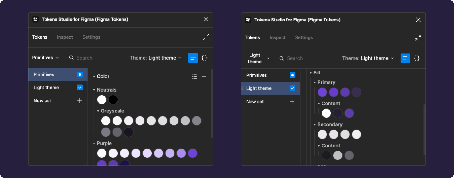
Tokens Studio interface showing color token references from the primitives library.