


Modern product teams are working with more data than ever. Every feature release, customer interaction, and event stream generates metrics that teams rely on to make decisions. But as the volume of data grows,the number of ways to slice it increases. This makes it more challenging to validate results, trace discrepancies, and answer follow-up questions quickly.
With Product Analytics, you can now view the SQL behind any chart in the platform and see data tables for trends and funnels. Trends help you see how key events change over time. Funnels show where users drop off across a defined sequence of steps. Together, these capabilities give teams transparency into how metrics are calculated, and the flexibility to explore the underlying numbers. You can validate definitions, debug faster, and export the details you need for deeper analysis or collaboration.
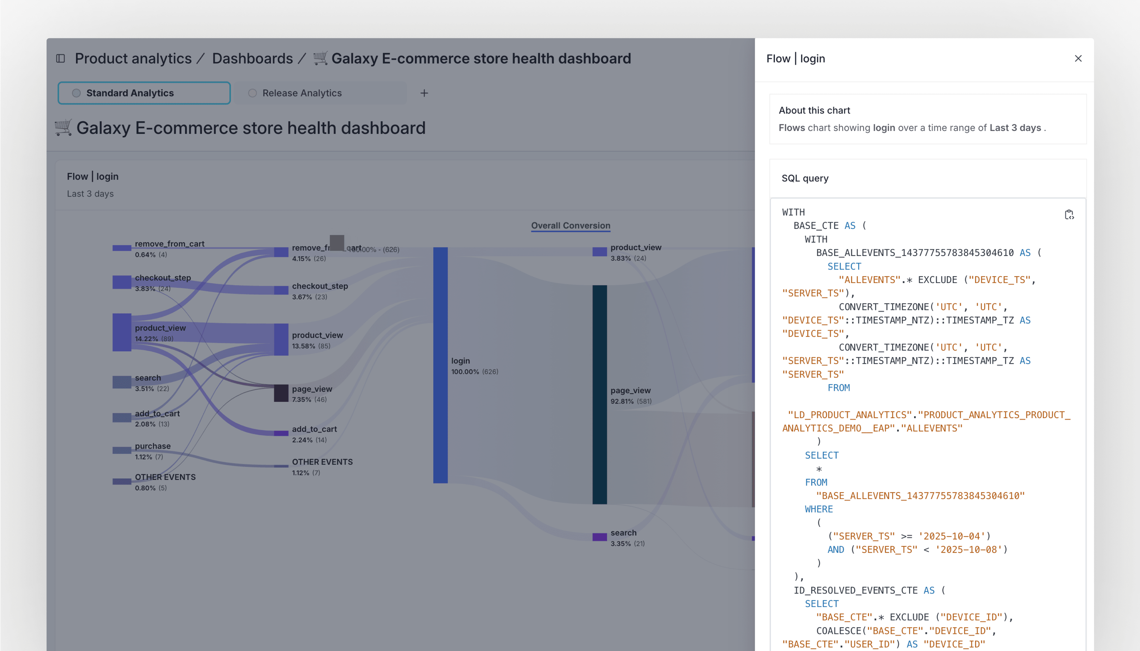
View the SQL powering your metrics
Charts help you spot what changed. When you need to explain why it changed, seeing the query behind the chart reveals the answers you need.
Product Analytics lets you view the SQL behind any chart from the chart menu. The query reflects your configuration, including chart type, filters, breakdowns, cohorts, and time ranges. You can copy the SQL, download it, or run it in your own warehouse or BI tools to compare definitions or join with other tables.
This gives teams a clear way to validate results and resolve questions quickly. For example, if a conversion metric looks lower than expected after a release, you can look at the SQL, cohort logic, and active time window. From there you might identify a filter that excludes new trials from a campaign. You can run the query in your warehouse with the adjusted filter and confirm that the metric behaves as intended for the audience you care about. Share the updated result with stakeholders so everyone is aligned on the same calculation.
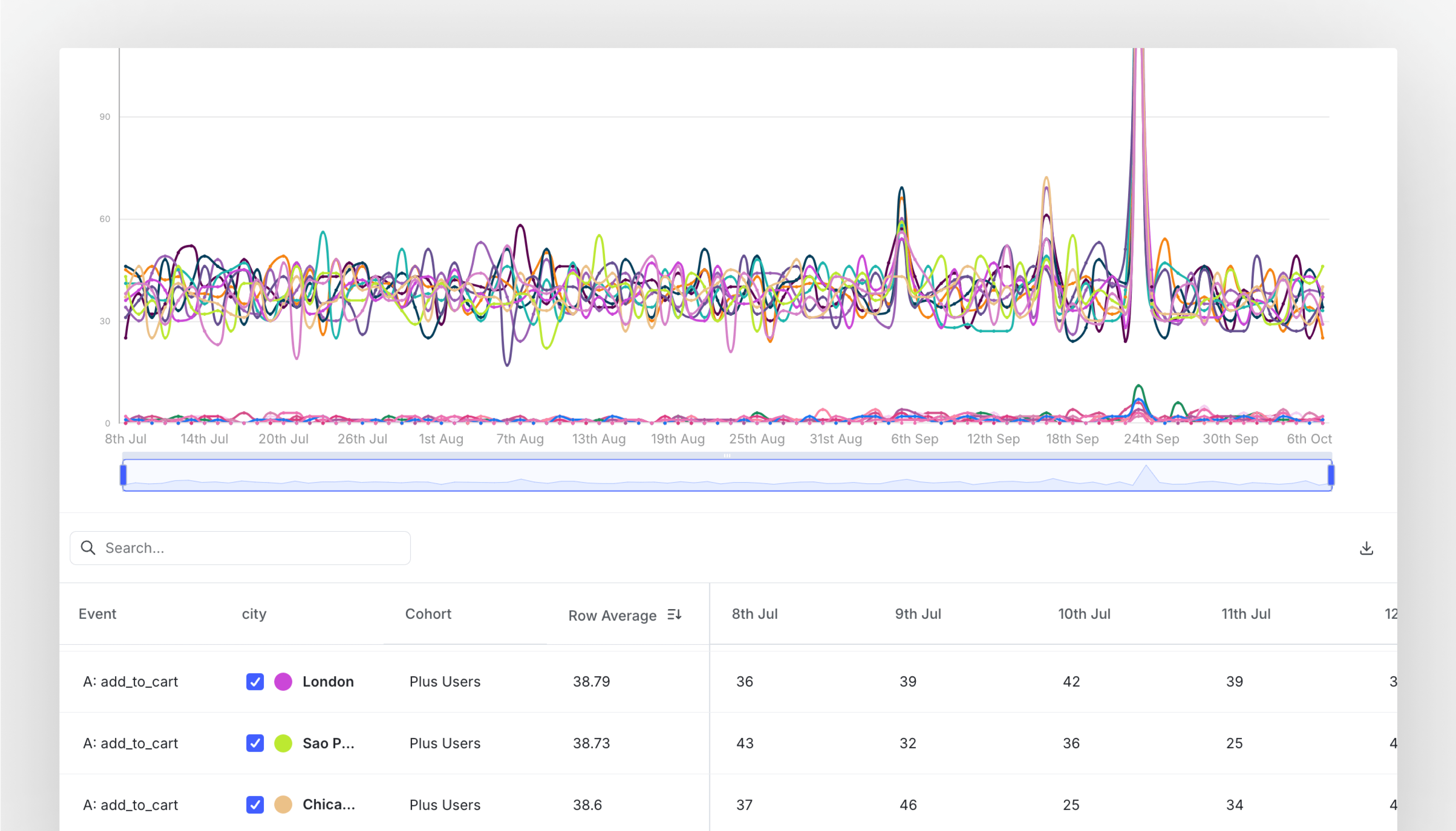
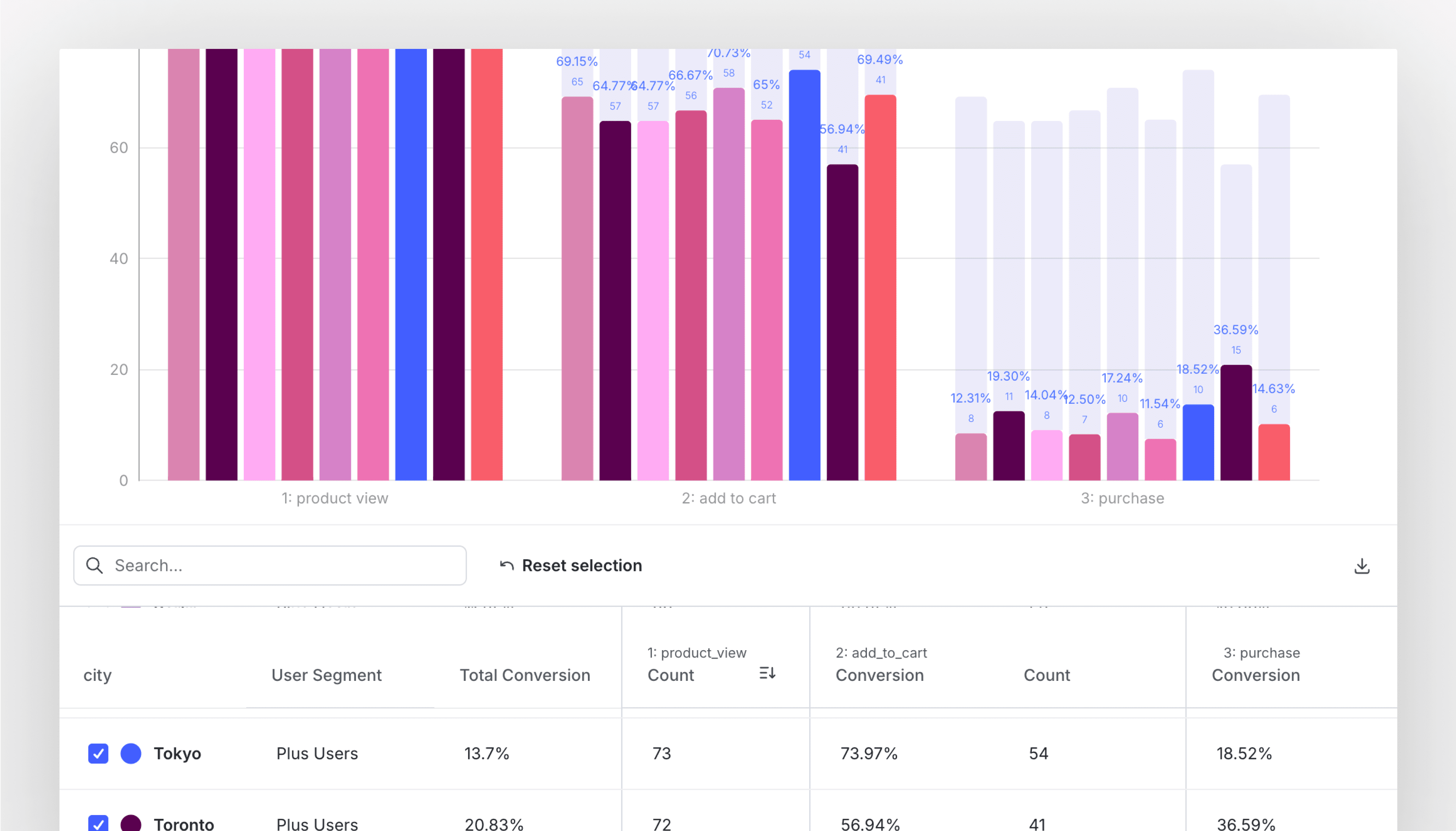
Explore data tables for trends and funnels
Charts help you spot patterns quickly. When you need to answer follow-up questions or compare segments in detail, tables make that work easier.
Product Analytics lets you open a data table alongside your chart for trends and funnels. The table reflects your configuration, including properties, cohorts, dates, and the exact series shown. You can search and sort the table, see all rows (even when the chart only highlights a subset), and download the results as a CSV for deeper analysis.
This gives teams a clear path from a high-level view to the specific numbers behind it. For example, say a weekly signups trend looks flat, but a stakeholder believes a new onboarding change helped a specific segment. Open the table, filter to the relevant cohort, and scan the daily values to confirm where the lift appears. If you need to share more context, export the table and add a short note about which properties and time window you used. The conversation moves from opinion to evidence, and everyone is looking at the same definitions.
Tables are equally helpful for funnels. You can see step counts and conversion from the previous steps, all broken down by properties or cohorts. If the chart focuses on the top series, the table still shows every row, which helps you catch meaningful segments that might not appear in the visualization. A growth lead investigating a checkout drop-off can sort by step-one volume, scan step-two conversion by device type, and quickly identify where the friction is highest. From there, they can download the table and attach it to a ticket so engineering and design have the same data during triage.
Get started with Product Analytics
Product Analytics gives teams speed, trust, and flexibility in how they use data. With SQL visibility and data tables for trends and funnels, you can assess exactly how metrics are calculated, dig into the details behind them, and share results with confidence. Sign up for a product demo today.
Like what you read?
Get a demo