Something feels different...
LaunchDarkly’s look-and-feel hasn’t changed significantly since the company's founding in 2014. As we’ve expanded our feature set and customer base, the user interface (UI) has struggled to keep up with the quality of product flows it now supports. Hence, an app refresh was overdue!
So, as part of the overall company rebrand, we set out to modernize and clean up LaunchDarkly's UI to truly reflect its status as a best-in-class product.
This post will walk you through two significant updates. Remember that this UI refresh is an ongoing process that we plan to continue investing in, so keep your eyes peeled for more updates.
Navigation
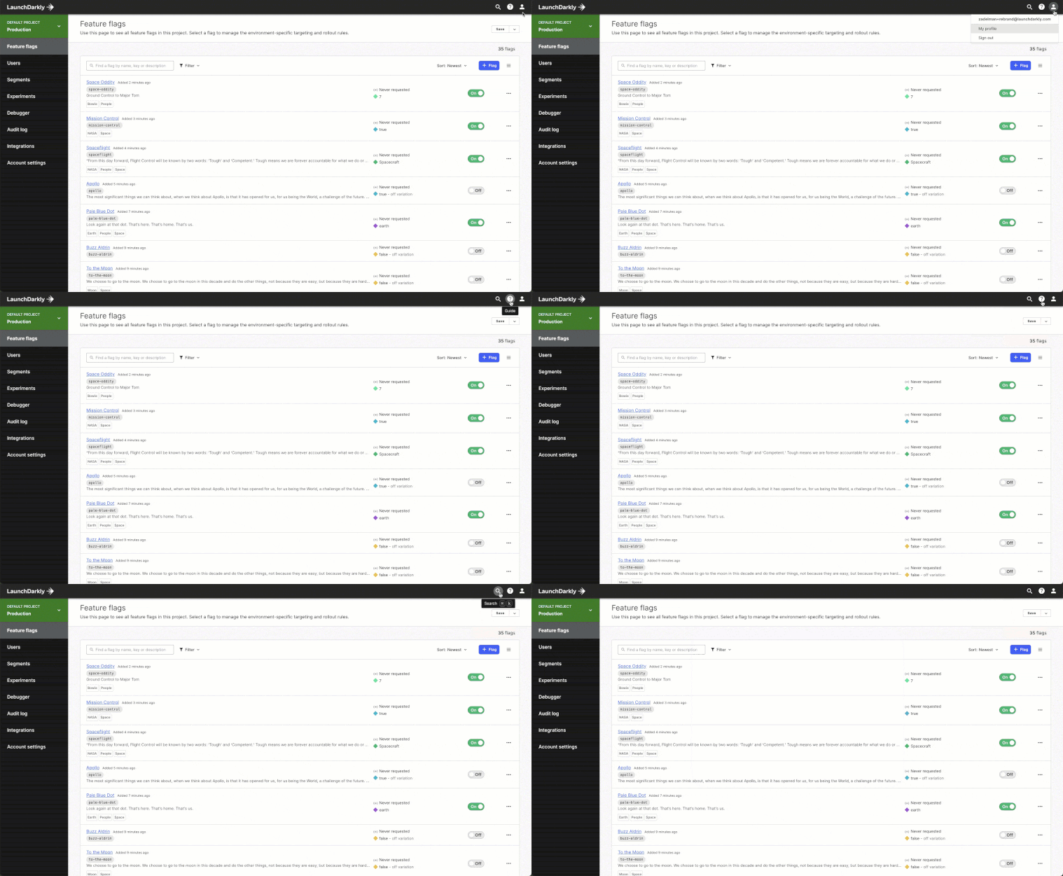
LaunchDarkly has a new top nav, which includes:

- Account - User profile and sign out have both moved from the left navigation to the avatar icon in the top right
- Guide - Help, Documentation, What’s New, and Quickstart have all moved under the question mark icon
- Search - Command bar search actions can be triggered from the magnifying glass icon in the top bar
Search: Command bar
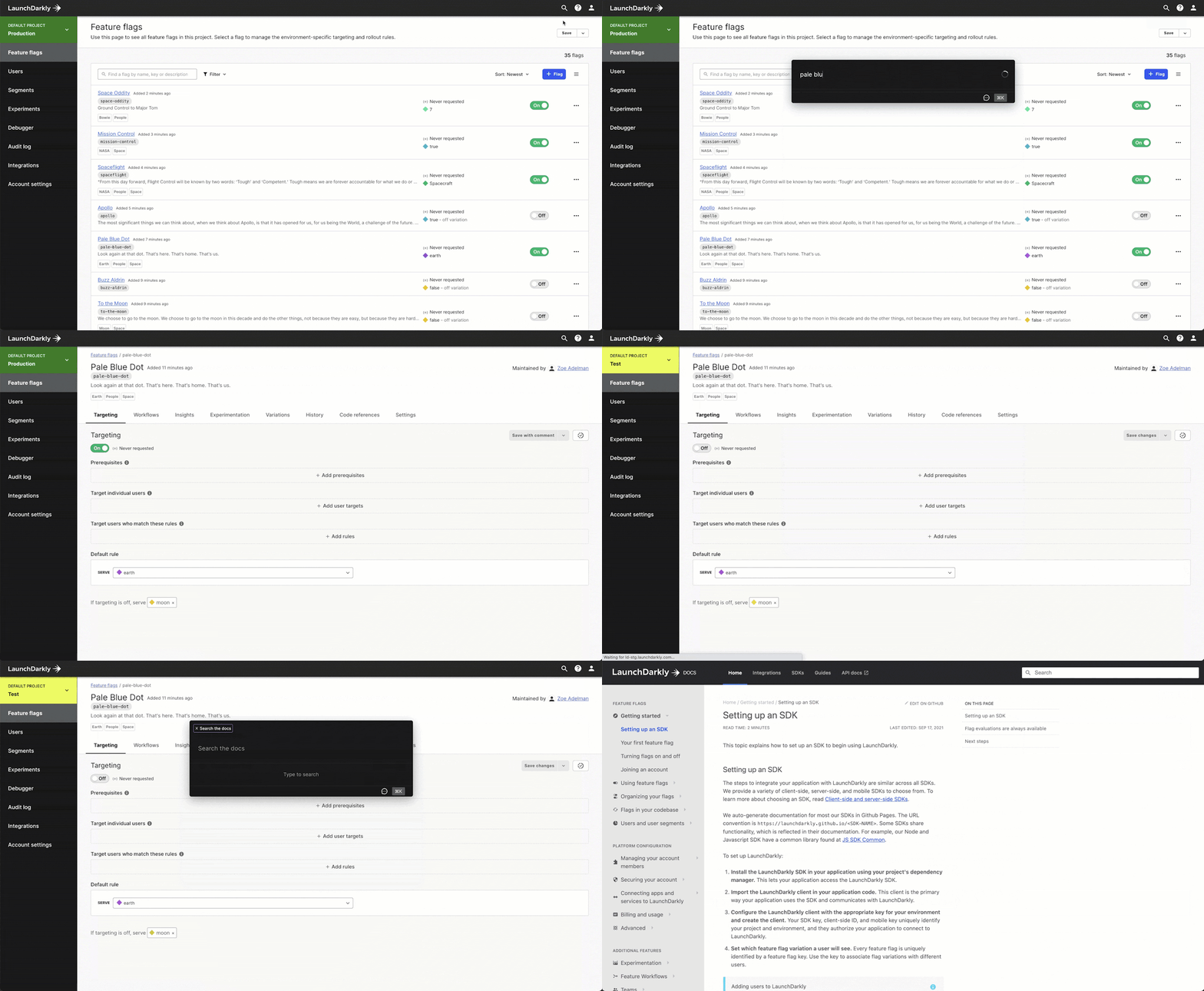
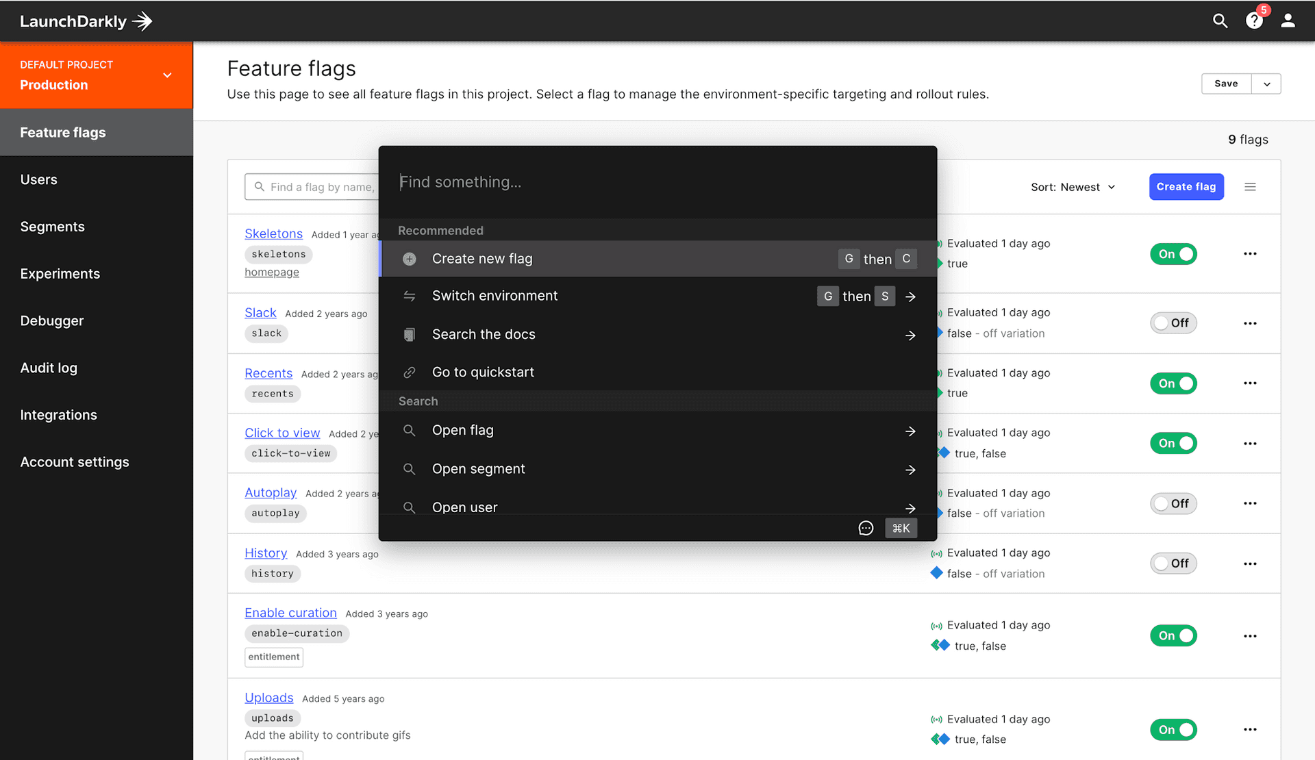
Finding the content you want in LaunchDarkly can be burdensome, especially when potentially supporting multiple projects, a handful of environments, and hundreds of flags. That’s why we’ve introduced the command bar, which optimizes search, navigation, and other actions—all without any mouse clicks.
With just a few keystrokes, you can now:
- Search flags globally
- Create new flags
- Switch environments (and projects)
- Search documentation
- Navigate to segments, users, and projects

Access the command bar
Command bar is available now for all LaunchDarkly customers. In addition to the magnifying icon in the top bar, you can also trigger the command bar by entering the following keyboard shortcut:
- CMD+K (Mac)
- CTRL+K (PC)
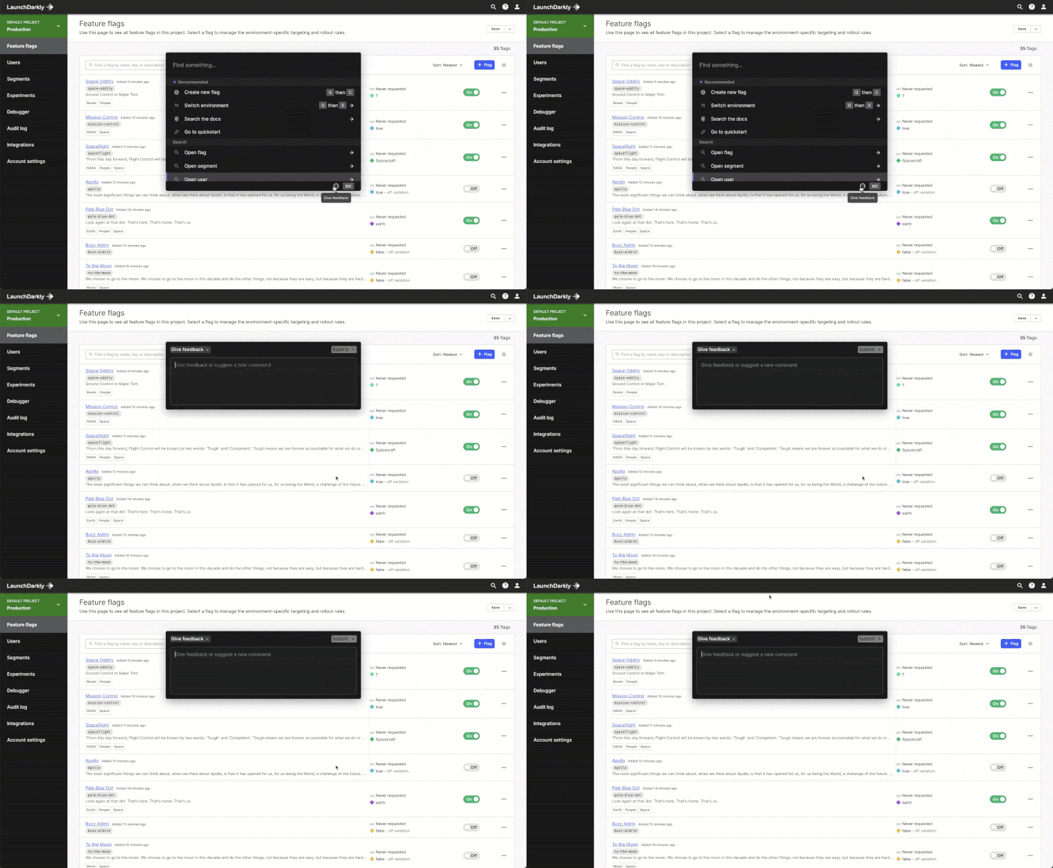
We’re excited to hear your thoughts about these new updates, so shoot us a message at feedback@launchdarkly.com. Also—got any commands you’d like to see that we haven’t added yet?—let us know by adding a suggestion, directly from the command bar.


