Even if you know how to code, you might not always want to experience the joy of editing raw HTML files when it’s time to update the copy on your website.
Content Management Systems, or CMSs, offer an interface to create and edit content such as images, blog posts, headlines, etc without having to directly touch a website’s code.
Just as feature flags are useful in traditional web and mobile applications, they could be used with a CMS to personalize a website for specific audiences, run a/b experiments, or gradually upgrade to new CMS versions.
In this tutorial, you’ll learn how to use LaunchDarkly feature flags to show and hide front-end features in a Contentful + React web application.
Prerequisites
- A free LaunchDarkly account - sign up for one here
- A developer environment with git and npm installed
Knowledge of React and front-end web development is helpful, but not required
Contentful CMS: the basics
Contentful is a popular headless CMS. Headless CMS architecture keeps the back end separate from the presentation layer of an application. Essentially, you define how you’d like to structure your content, and Contentful provides an API to fetch the data based on that structure. Then you can use whatever front end you’d like to render that data.
A headless CMS gives you the flexibility to re-use your content across multiple channels, such as:
- web applications
- mobile applications
- AI agents
- voice assistants
- Whatever new and exciting trends our omnichannel future might bring
In this tutorial, we’re using public credentials for an example Contentful application that displays a sample product catalog. With this approach there’s no need to create a Contentful account, let alone roll our own content model.
For you impatient types, here is a repository with fully working code.
Creating an example React app with Vite
Let’s use Vite to create our example app since create-react-app is no longer officially supported.
Open up a terminal and run the following commands:
npm create vite@latest contentful-launchdarkly --templateSelect a framework: React
Select a variant: JavaScript
When Vite has finished, run these commands:
cd contentful-launchdarkly
npm install
npm run dev
Load http://localhost:5173/ in your browser and behold the sample application. Using a counter for state management: a true classic.
Getting started with React and Contentful
Buckle up - we’re going to modify our example app to render the Contentful product catalog.
In your terminal, run this command to install the Contentful SDK:
npm install contentfulCreate a new file in the src/ folder named ProductCatalog.jsx. Copy the following code into it:
import React from "react";
import * as contentful from "contentful";
import "./ProductCatalog.css";
// ordinarily these should be saved in an .ENV file
// but these are demo credentials that are public!
const contentfulClient = contentful.createClient({
accessToken:
"0e3ec801b5af550c8a1257e8623b1c77ac9b3d8fcfc1b2b7494e3cb77878f92a",
space: "wl1z0pal05vy",
});
const PRODUCT_CONTENT_TYPE_ID = "2PqfXUJwE8qSYKuM0U6w8M";
const ProductCatalog = () => {
const [products, setProducts] = React.useState([]);
React.useEffect(() => {
contentfulClient
.getEntries({
content_type: PRODUCT_CONTENT_TYPE_ID,
})
.then((entries) => {
setProducts(entries.items);
});
}, []);
return <ProductList products={products} />;
};
const ProductList = ({ products }) => {
return (
<>
<div className="products">
{products.map((product) => (
<ProductItem key={product.sys.id} product={product} />
))}
</div>
</>
);
};
const ProductItem = ({ product }) => {
const { fields } = product;
return (
<div className="product-in-list">
<div className="product-image">
<ProductImage image={fields.image[0]} slug={fields.slug} />
</div>
<div className="product-details">
<ProductDetails fields={fields} />
</div>
</div>
);
};
const ProductDetails = ({ fields }) => {
return (
<>
<ProductHeader fields={fields} />
<p className="product-categories">
{fields.categories.map((category) => category.fields.title).join(", ")}
</p>
<p>{fields.price} €</p>
<p className="product-tags">
<span>Tags:</span> {fields.tags.join(", ")}
</p>
)
</>
);
};
const ProductHeader = ({ fields }) => {
return (
<div className="product-header">
<h2>
<a href={`product/${fields.slug}`}>{fields.productName}</a>
</h2>
{" by "}
<a href={`brand/${fields.brand.sys.id}`}>
{fields.brand.fields.companyName}
</a>
</div>
);
};
const ProductImage = ({ image, slug }) => {
if (image && image.fields.file) {
return (
<a href={`product/${slug}`}>
<img
src={image.fields.file.url}
alt={image.fields.title || "Product image"}
/>
</a>
);
}
return null;
};
export default ProductCatalog;Shall we sprinkle on some CSS so that it looks a bit prettier? Add a file in src/ named ProductCatalog.css like so:
.products {
 display: grid;
 grid-template-columns: repeat(auto-fill, minmax(300px, 1fr));
 gap: 2rem;
 padding: 2rem;
}

.product-in-list {
 border: 1px solid #e0e0e0;
 border-radius: 8px;
 padding: 1.5rem;
 background: white;
 box-shadow: 0 2px 4px rgba(0, 0, 0, 0.1);
 transition: transform 0.2s ease-in-out;
}

.product-in-list:hover {
 transform: translateY(-4px);
 box-shadow: 0 4px 8px rgba(0, 0, 0, 0.15);
}

.product-image {
 text-align: center;
 margin-bottom: 1rem;
}

.product-image img {
 border-radius: 4px;
 object-fit: cover;
 width: 200px;
 height: 200px;
}

.product-details {
 color: #333;
}

.product-header h2 {
 margin: 0 0 0.5rem 0;
 font-size: 1.25rem;
}

.product-header a {
 color: #2c5282;
 text-decoration: none;
}

.product-header a:hover {
 text-decoration: underline;
}

.product-categories {
 color: #666;
 font-size: 0.9rem;
 margin: 0.5rem 0;
}

.product-tags {
 font-size: 0.875rem;
 color: #666;
}

.product-tags span {
 font-weight: 600;
}
We’ll need to modify App.jsx to render the ProductCatalog component. Replace all the code currently in the file with this:
import ProductCatalog from './ProductCatalog.jsx'
import './App.css'

function App() {
 return (
   <>
     <h1>LaunchDarkly + Contentful</h1>
     <h2>Product Catalog Demo</h2>
     <ProductCatalog />
   </>
 )

}
export default App
Reload http://localhost:5173/ and check out this fetchingly European product catalog.

Adding a LaunchDarkly Feature Flag to your Contentful React application
Run this command in your terminal to install the LaunchDarkly React Web SDK:
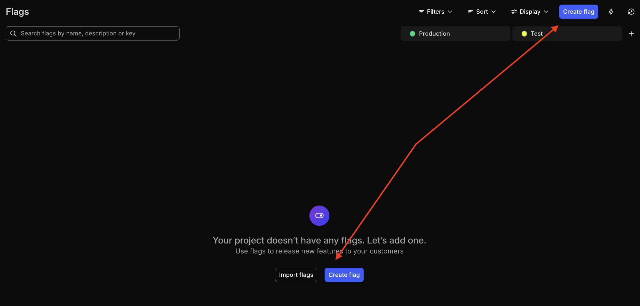
npm install launchdarkly-react-client-sdkTime to create a new feature flag. In the LaunchDarkly application, click “Create flag.”
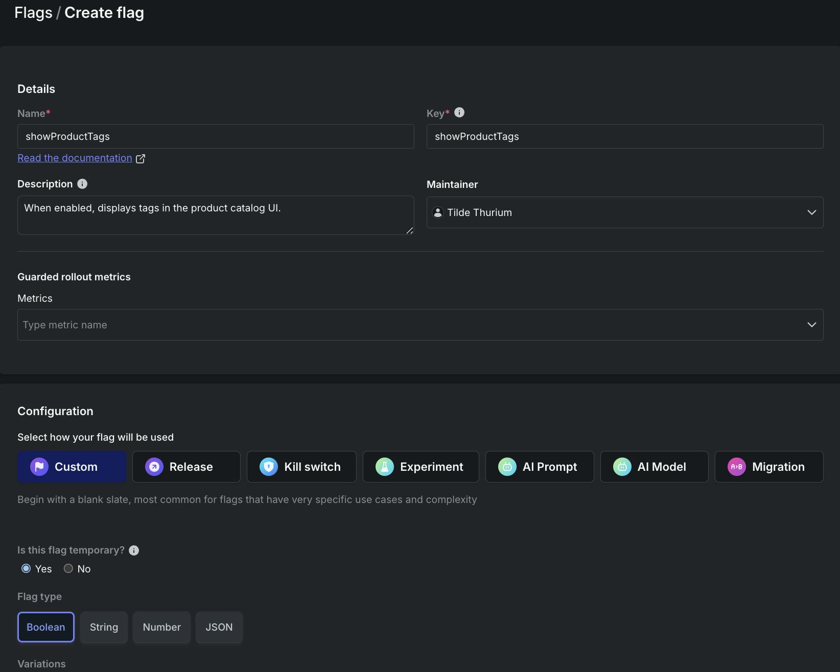
Create a flag with the following configuration:
- Name: showProductTags
- Description: When enabled, displays tags in the product catalog UI
- Flag type: boolean
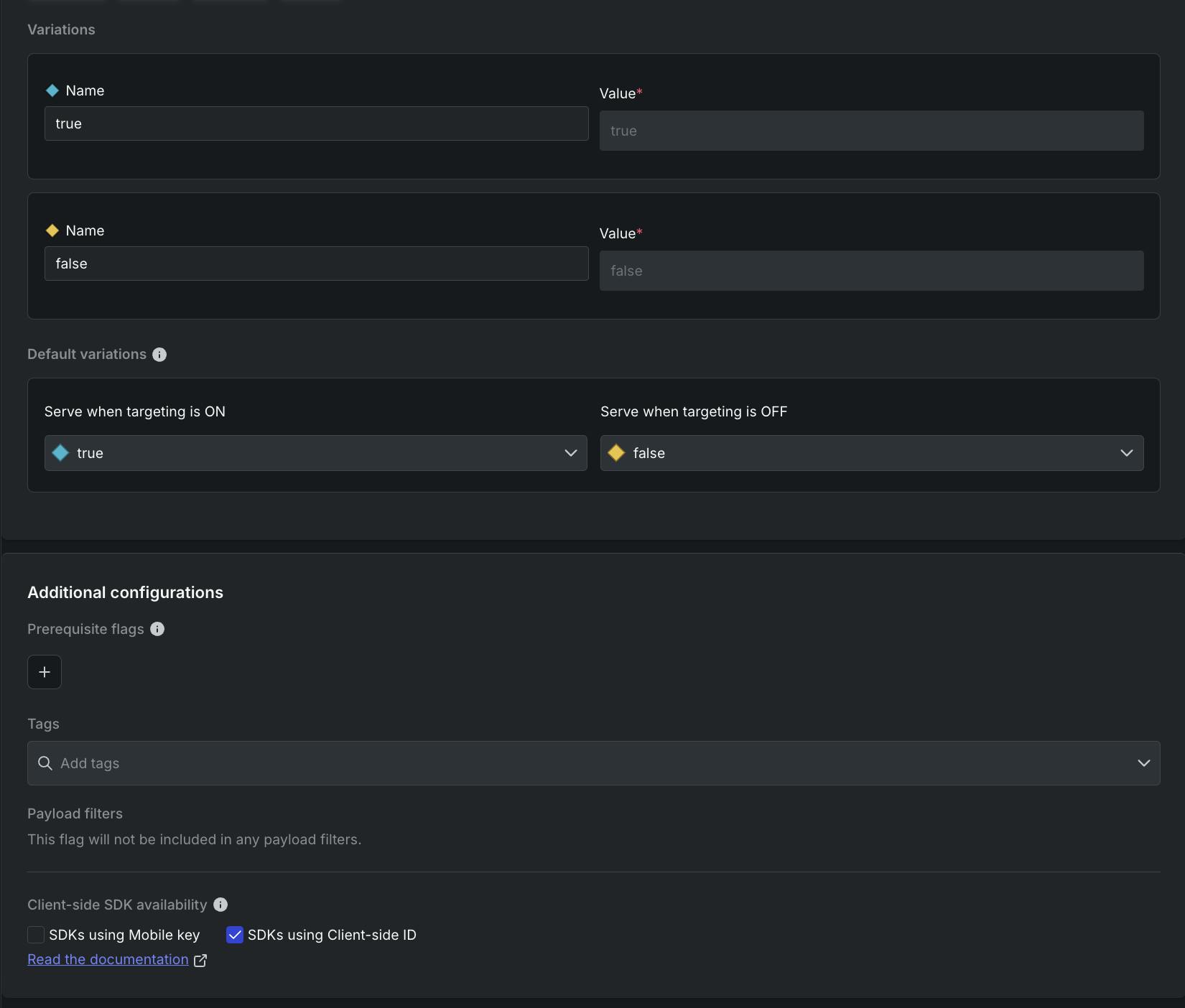
Flag variations:
- True: true
- False: false
- When targeting is On, serve True
- Check the box that says “SDKs using client-side ID”
When all that is good to go, click “Create flag.”
On the next screen, click on the … menu next to the Production environment. In the dropdown, select “Client-side ID” to copy that value to the clipboard.
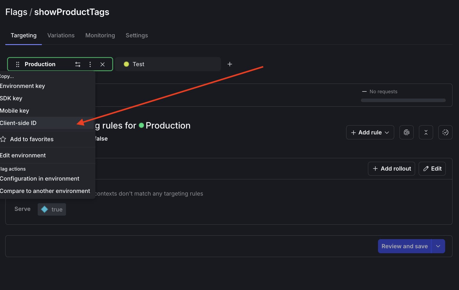
Paste the client side ID into src/main.jsx. It’s not a secret, no need to fiddle with an .env file! While you’re at it, modify the rest of the code in that file as follows:
import { StrictMode } from 'react'
import { createRoot } from 'react-dom/client'
import './index.css'
import App from './App.jsx'
import { asyncWithLDProvider } from 'launchdarkly-react-client-sdk';

const init = async () => {
 const LDProvider = await asyncWithLDProvider({
   clientSideID: 'PASTE YOUR CLIENT SIDE ID HERE',
   context: {
     "kind": "user",
     "key": "user-key-123abc",
     "name": "Sandy Smith",
     "email": "sandy@example.com"
   },
   options: { }
 });

 createRoot(document.getElementById('root')).render(
   <StrictMode>
     <LDProvider>
       <App />
     </LDProvider>
   </StrictMode>,
 );
};

init();
Here, we use the asyncWithLDProvider higher-order component (HOC). This code initializes the LaunchDarkly client at the root of our component tree, before any of the child components are rendered. There is a tradeoff here: this approach adds some latency to the app’s cold start time, but prevents the possibility of UI flickering.
Alternatively, you can use the withLDProvider HOC, which doesn’t initialize the LaunchDarkly client until componentDidMount. That cuts down start time latency but introduces the possibility of UI flickering if the component re-renders when it receives a new flag value. For more information see the LaunchDarkly React Web SDK documentation.
Let’s modify the ProductDetails component to evaluate the feature flag’s value and conditionally show the tags. In ProductCatalog.jsx, add a line at the top of the file:
import { useFlags } from 'launchdarkly-react-client-sdk';Replace the existing ProductDetails component with the following:
const ProductDetails = ({ fields }) => {
const { showProductTags } = useFlags();
console.log("showProductTags", showProductTags);
return (
<>
<ProductHeader fields={fields} />
<p className="product-categories">
{fields.categories.map((category) => category.fields.title).join(", ")}
</p>
<p>{fields.price} €</p>
{showProductTags ? (
<p className="product-tags">
<span>Tags:</span> {fields.tags.join(", ")}
</p>
): null}
</>
);
};Since the flag is currently off, if you reload http://localhost:5173/ the catalog should not display tags:
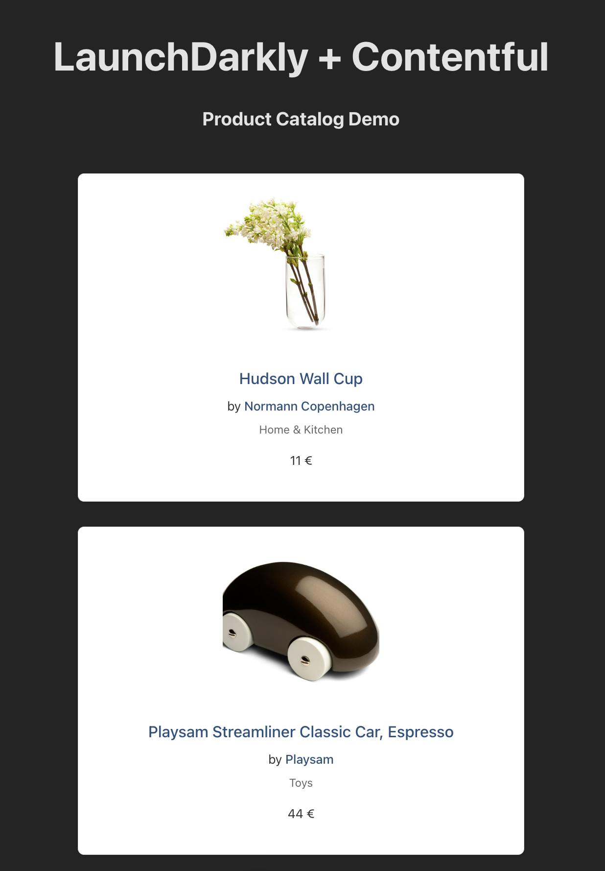
In the LaunchDarkly app, turn the flag on.

If your LaunchDarkly configuration requires it, add a confirmation message explaining why you are turning the flag on, such as “Hiding the tags from prying eyes in Production, #YOLO.”
Reload the app and you should see the tags again. Well done!
Wrapping it up: using Contentful and React with LaunchDarkly feature flags
If you’ve been following along, you’ve learned how to integrate LaunchDarkly’s React Web SDK into a Contentful application.
If you’re curious about what else you can do with LaunchDarkly and React, here’s some further reading:
- How to build a Pokédex with a Game Mode with Next.js, Vercel, PokeAPI, and LaunchDarkly
- Boost Your Next.js Reality TV Scenario Generator: Rate Limiting and Targeting with Arcjet and LaunchDarkly
- React Web SDK Overview
Thank you! If you have any questions you can holler at me via email (tthurium@launchdarkly.com), Bluesky, or LinkedIn.


