Frequentist experiment results
This topic explains how to read the results of a frequentist experiment.
The winning variation
For experiments that use frequentist statistics, the winning variation for an experiment is the variation that has the highlighted p-value. You should ship a winning variation only after the experiment has reached its needed sample size.
Sharing options
To download and share a PDF version of the experiment Results tab, click Download PDF. A PDF version of the results downloads to your machine.
Visualization options
The results table has the following visualization options:
- Forest plot
- Relative difference
- Arm averages
Expand visualization options
Forest plot
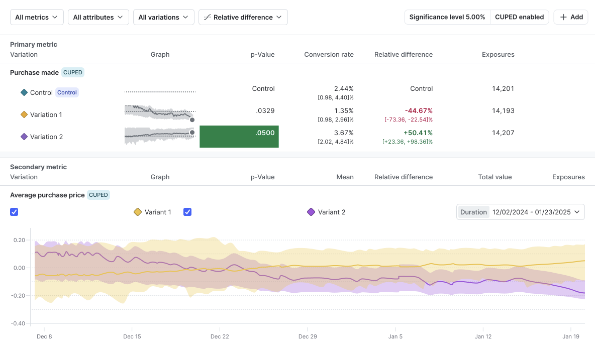
The forest plot displays the confidence interval for each treatment variation with respect to the control variation.
Each horizontal bar represents the confidence interval for the metric. The confidence interval shows the likely range of values for the average of the metric you’re computing, if you were to repeat the experiment many times. The bar extends to the lower and upper limits of that confidence interval. The midpoint of the bar is the observed mean value for the metric.
When the confidence interval no longer overlaps the 0% vertical line on the forest plot, that means the difference between the control variation and the treatment variation is statistically significant. The bar for the variation then displays green or red, depending on whether the variation is performing better or worse than the control.
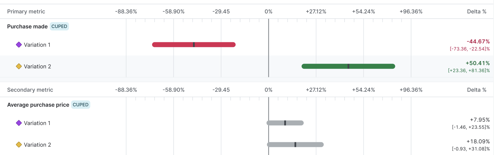
The forest plot is the most efficient summary of how much variability there is in your experiment data and how close to statistical significance the comparisons are. The forest plot should be your main decision-making tool when deciding on a winning variation for frequentist experiments.
Relative difference
The relative difference graph displays a time series of the relative difference between the treatment variation and the control. This graph is helpful for investigating trends in relative differences over time.
Arm averages
The arm averages graph displays the average metric value over time for each variation. This graph is useful for investigating trends that impact all experiment variations equally over time.
Filter options
You can filter an experiment’s results table by metric, variation, or attribute value.
Expand filter options
Metrics filter
When you create an experiment, you can add one or more metrics for the experiment to measure. If an experiment is measuring more than one metric, you can filter the results to view only select metrics at a time. You cannot add additional metrics to an experiment after you create it.
To filter your results by metric, click All metrics and select the metric you want to view. The results table updates to show you results from only the metrics you selected.
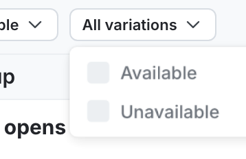
Variations filter
To filter your results by variation, click All variations and select the variations you want to view. The results table updates to show you results from only the variations you selected.
Attributes filter
When you create an experiment, you can designate one or more context attributes as filterable for that experiment. If a context attribute is filterable, you can filter the experiment results by those attribute’s values. For example, if you designate the “Country” attribute as filterable, then you can narrow your results by users with a “Country” attribute value of Canada.
You cannot designate additional context attributes as filterable after you create an experiment.
To filter your results by context attribute value:
- Click All attributes. A list of context attributes appears.
- Hover over the context attribute you want to filter by. A list of available values for that attribute appears.
- Search for and select the attribute values you want to view.
The results table updates to show you results from only contexts with the attribute value that you selected.
Results table data
This section explains the columns that display in the experiment results table.
Graph
The “Graph” column displays the forest plot, relative difference, or arm averages graph for a specific variation, depending on the visualization option you have selected. Click on the graph to view an enlarged version.
P-value
The p-value is a measure of how likely it is that any difference observed between a treatment variation and the control variation is due to random chance, rather than an actual difference in performance between the two variations.
The idea that there is no actual difference between two groups is called the “null hypothesis.” The p-value helps determine whether you should accept or reject the null hypothesis for a given set of variations.
The standard p-value for LaunchDarkly experiments is 0.05, but you can set a different p-value when you create an experiment.
The p-value helps determine whether the null hypothesis is true for a given set of variations:
- Generally, a p-value of less than or equal to 0.05 suggests that the observed data is due to actual differences in performance between the treatment variation and the control variation, and not due to random chance.
- A p-value of more than 0.05 suggests that the observed data is not due to actual differences in performance between the treatment variation and the control variation, but instead due to underlying noise in the data.
In rare cases, the “P-value” column will display “N/A” when the baseline mean is zero.
P-values in experiments using funnel metric groups
Expand P-values in experiments using funnel metric groups
In experiments using funnel metric groups, LaunchDarkly calculates the p-value for each step in the funnel, but the final metric in the funnel is the metric you should use to decide the winning variation for the experiment as a whole.
LaunchDarkly includes all end users that reach the last step in a funnel in the experiment’s winning variation calculations, even if an end user skipped some steps in the funnel. For example, if your funnel metric group has four steps, and an end user takes step 1, skips step 2, then takes steps 3 and 4, the experiment still considers the end user to have completed the funnel and includes them in the calculations for the winning variation.
Relative difference
The relative difference from the control variation measures how much a metric in the treatment variation differs from the control variation, expressed as a proportion of the control’s estimated value.
The confidence interval below the relative difference shows the range of values within which the true relative difference is likely to fall if you were to repeat the experiment many times. For example, if the 90% confidence interval for the relative difference was [-20%, +40%], then in a theoretical scenario where you repeated the experiment many times, we would expect around 90% of those experiments to show a relative difference between -20% and +40%.
LaunchDarkly calculates this by taking the difference between the treatment variation’s estimated value and the control variation’s estimated value, then dividing that difference by the control variation’s estimated value.
In rare cases, the “Relative difference” column will display “N/A” when the baseline mean is zero.
Sample size
The “Sample size” column displays how many unique contexts encountered each variation of the experiment. Click a value in this column to view a breakdown of any units that were excluded from consideration.
To learn more about troubleshooting if your experiment hasn’t received any metric events, read Experimentation Results page status: “This metric has never received an event for this iteration”.
Results when the baseline mean is zero
In frequentist experiments, LaunchDarkly does not compute statistical summaries for p-values, relative differences, or confidence intervals when the mean of the control variation is zero. This is because the relative difference above a baseline value of zero is undefined, and therefore any statistical summaries based off of that baseline value are also undefined. In these cases, the column will have a value of “N/A.”
LaunchDarkly still displays raw event counts and means (for numeric and count metrics) or rates (for binary metrics) on the results page. When the baseline mean is zero, we recommend using these aggregates to help make a decision instead.
Metric-specific results
The remaining columns in a frequentist experiment results table vary depending on the metric in the experiment. Expand the sections below to learn about which columns display for each metric type.
Binary conversion metrics
Binary conversion metrics include:
- Custom conversion binary metrics
- Clicked or tapped conversion metrics using the Count distinct units (Percent) option
- Page viewed conversion metrics using the Count distinct units (Percent) option
Expand Binary conversion metrics
Conversion rate
The value for each unit in a binary conversion metric can be either 1 or 0. A value of 1 means the conversion occurred, such as a user viewing a web page, or submitting a form. A value of 0 means no conversion occurred.
The “Conversion rate” column displays the percentage of units with at least one conversion. For example, the percentage of users who clicked at least once.
For experiments using funnel metric groups, the conversion rate includes all end users who completed the step, even if they didn’t complete a previous step in the funnel. LaunchDarkly calculates the conversion rate for each step in the funnel by dividing the number of end users who completed that step by the total number of end users who started the funnel. LaunchDarkly considers all end users in the experiment for whom the SDK has sent a flag evaluation event as having started the funnel.
Count conversion metrics
Count conversion metrics include:
- Custom conversion count metrics
- Clicked or tapped conversion metrics using the Count option
- Page viewed conversion metrics using the Count option
Expand Count conversion metrics
Mean
The value for each unit in a count conversion metric can be any positive value. The value equals the number of times the conversion occurred. For example, a value of 3 means the user clicked on a button three times.
The mean is the average number of conversions across all units in the metric. For example, the average number of times users clicked on a button.
Numeric metrics
Expand Numeric metrics
Mean
The value for each unit in a numeric metric can be any positive value. The mean is the variation’s average numeric value.