Trends charts
Overview
This topic explains how to create a trends chart in the product analytics Dashboards tab.
A trends chart shows changes in event data over time. Trends charts visualize and analyze key usage data, such as the number of users performing a certain action, the number of different countries users are logging in from, the composition of these metrics, and more. You can observe these numbers in both line charts and table views.
A trends chart can help you answer the following types of questions:
- How many times did users in the
USvisit the home page in the last 30 days? - How many users initiated the “search” event yesterday?
- How many games did each user play in the last week?
- Which sources generated the most signups?
Create a trends chart
To create a dashboard with a trends chart:
- In the left navigation, expand Observe, then click Dashboards.
- Click New dashboard. The “Create dashboard” dialog opens.
- Enter a Dashboard name. Click Create.
- Click Add content and choose the “Trends” type from the dropdown that appears. The “Events” configuration menu appears.
- Click in the “Events” search bar and choose a tracked event or metric to track. Optionally, update the “Measuring” type. The following measuring types are available:
- Uniques: Number of unique users who performed the event. Uniques counts one event per user.
- Totals: Total number of events performed. Totals counts every occurrence of the event.
- Frequency per user: Number of times one user performs that event
- Aggregate properties: Aggregate property value across all occurrences of the event
- (Optional) Choose more events to track.
- In the “Breakdown” section, click the + icon to expand menu options. Choose a property or a cohort to use for the breakdown. Click Add Breakdown.
- In the “Filters” section, click the + icon to expand menu options. Choose a filter to apply to the data. Click Add Filter.
- (Optional) In the event table below the chart, check or uncheck the checkbox next to different event types to show or hide those events on the trends chart.
- Click Save. The new dashboard content appears.
Advanced configuration options
There are more configuration options available for trends charts. These can help you refine your trends chart to better meet your needs. Here are some examples:
Change the trends chart view
You can view a trends chart in two ways:
- Line chart: Line charts help you understand how an event metric trends over time.
- Table view: Table views display event and formula occurrence counts over time.
- Bar chart: Bar charts show how frequently events occur relative to each other.
Views can be configured to be viewed at any time granularity: day, week, month, or all time.
Adjust the formula
Use the Formula button to calculate and compare custom metrics on the same chart. You can write formulas using simple arithmetic operators that product analytics applies to the events you’ve included in your chart.
Use parentheses ( () ) to configure the order of operations. Product analytics supports the following operators:
- Add (
+) - Subtract (
-) - Multiply (
*) - Divide (
/)
To adjust the formula:
- In the trends chart, click Formula. The Formula window opens.
- Click New formula.
- Enter a Label for the formula.
- Select a Unit from the dropdown.
- Type or paste your formula in the “Formula” field.
- Click Apply.
Here are some example formulas:
-
Conversion rate:
B / A * 100A= Homepage (Uniques), the number of users who visited the homepage.B= SignUpSuccess (Uniques), the number of users who signed up successfully.
This formula calculates the percentage of homepage visitors who completed the sign-up process.
-
Average visits per user:
B / AA= Homepage (Uniques), the number of users who visited the homepage.B= Homepage (Totals), the total number of homepage visits.
This formula calculates the average number of homepage visits per user.
-
Cohort comparison (per-user visits):
(A / B) / (C / D)A= Homepage (Totals) with filtercountry = US, the total number of homepage visits by US users.B= Homepage (Uniques) with filtercountry = US, the number of unique US users who visited the homepage.C= Homepage (Totals) with filtercountry = VN, the total number of homepage visits by VN users.D= Homepage (Uniques) with filtercountry = VN, the number of unique VN users who visited the homepage.
This formula calculates the ratio of the average number of homepage visits per user between US and VN cohorts.
Add event-level filters
You can add more filters to your chart by clicking the Add filter icon multiple times. Multiple event property filters are combined using the AND function.
Refine the “Calculation” field
In this field, a property refers to either a user attribute or an event property tied to the event. If your property is a non-integer property, you can see the number of distinct types of the property that triggered the event. For example, you can see the number of different countries from which users logged in on a particular day. You can do things like average, max, min, and more for integer properties.
Show and hide different event types
You can show or hide different event types from the trends chart using the chart’s data table.
To show or hide different event types on an existing chart:
- From the dashboard, click on the name of a trends chart. The chart editor opens.
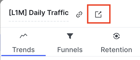
- Click the full-page icon:
- In the event table below the chart, check or uncheck the checkbox next to different event types to show or hide those events on the trends chart.
- Click Save.