Bayesian experiment results
This topic explains how to read the results of a Bayesian experiment.
The winning variation
For experiments using Bayesian statistics, the winning variation is the variation with the highest probability to be best that exceeds the Bayesian threshold you set when you created the experiment.
If a Bayesian experiment has collected enough data to determine a winning variation, and the winning variation is not the control, then the winning variation is highlighted in green in its results table.
Ship the winning variation
To stop an experiment and ship the winning variation:
- Navigate to the experiment’s Results tab.
- Click Stop, or if your environment requires approvals, click Request approval to stop. The “Ship” menu appears.
- Select the winning variation to ship to all contexts that match the flag’s targeting rule. A “Stop experiment” dialog appears.
- Enter a Reason for stopping.
- Click Stop experiment.
Bayesian experiments also display a Ship it button if the experiment has enough data to determine a winning variation, and that winning variation is not the control. You can use this option to stop the experiment and ship the winning variation.
Sharing options
To download and share a PDF version of the experiment Results tab, click the download icon in the right sidebar. A PDF version of the results downloads to your machine.
Visualization options
You can view a Bayesian experiment’s results as a Results table or as a Forest plot. To switch between them, click the view menu and select the view you want.
In the Results table view, click a variation’s graph in the “Graph” column to open a larger version of the graph. In the enlarged view, you can adjust the date range, choose which variations to display, and select one of the following visualizations:
- Probability density
- Relative difference
- Arm averages
Expand visualization options
Probability density
The probability density graph displays the distribution of the results for each metric.
The horizontal x-axis displays the unit of the primary metric included in the experiment. For example, if the metric is measuring revenue, the unit might be dollars, or if the metric is measuring website latency, the unit might be milliseconds.
If the unit you’re measuring on the x-axis is something you want to increase, such as revenue, account sign ups, and so on, then the farther to the right the curve is, the better. The variation with the curve farthest to the right means the unit the metric is measuring is highest for that variation.
If the unit you’re measuring on the x-axis is something you want to decrease, such as website latency, then the farther to the left the curve is, the better. The variation with the curve farthest to the left means the unit the metric is measuring is lowest for that variation.
How wide a curve is on the x-axis determines the credible interval. Narrower curves mean the results of the variation fall within a smaller range of values, so you can be more confident in the likely results of that variation’s performance.
The vertical y-axis measures probability. You can determine how probable it is that the metric will equal the number on the x-axis by how high the curve is.
Relative difference
The relative difference graph displays a time series of the relative difference between the treatment variation and the control. This graph is helpful for investigating trends in relative differences over time.
Arm averages
The arm averages graph displays the average value over time for each variation. This graph is useful for investigating trends that impact all experiment variations equally over time.
Filter options
You can filter an experiment’s results table by metric, variation, or attribute value.
Expand filter options
Metrics filter
When you create an experiment, you can add one or more metrics for the experiment to measure. If an experiment is measuring more than one metric, you can filter the results to view only select metrics at a time. You can also add metrics to a running experiment. To learn how, read Add additional metrics.
To filter your results by metric, click All metrics and select the metric you want to view. The results table updates to show you results from only the metrics you selected.
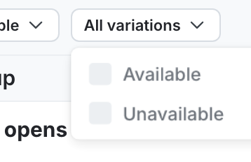
Variations filter
To filter your results by variation, click All variations and select the variations you want to view. The results table updates to show you results from only the variations you selected.
Attributes filter
When you create an experiment, you can designate one or more context attributes as filterable for that experiment. If a context attribute is filterable, you can filter the experiment results by those attribute’s values. For example, if you designate the “Country” attribute as filterable, then you can narrow your results by users with a “Country” attribute value of Canada.
You can also add filterable context attributes to a running experiment. To learn how, read Add attribute filters.
To filter your results by context attribute value:
- Click All attributes. A list of context attributes appears.
- Hover over the context attribute you want to filter by. A list of available values for that attribute appears.
- Search for and select the attribute values you want to view.
The results table updates to show you results from only contexts with the attribute value that you selected.
Results table data
This section explains the columns that display in the experiment results table.
Graph
The “Graph” column displays a probability density graph for each variation. Click a variation’s graph to open a larger version.
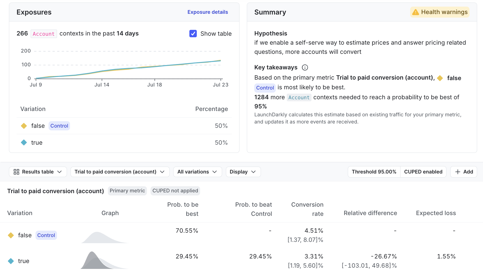
Probability to be best
The probability to be best for a variation is the likelihood that it outperforms all other variations for a specific metric. However, the probability to be best alone doesn’t provide a complete view. For example, when multiple treatment variations outperform the control, the probability to be best may decrease, even if the treatments are generally effective.
To get a comprehensive understanding, pair the probability to be best with the probability to beat control and expected loss. These metrics together provide a clearer picture of performance and trade-offs. To learn more, read Decision making with Bayesian statistics.
Probability to beat control
The probability to beat control represents the likelihood that this variation performs better than the control variation for a given metric. Probability to beat control is only relevant for treatment variations, as it measures the probability of outperforming the control, making it unnecessary for the control itself. When multiple treatment variations outperform the control, it’s helpful to also consider the probability to be best to determine the winning variation.
Probability to beat control in experiments using funnel metric groups
Expand Probability to beat control in experiments using funnel metric groups
In experiments using funnel metric groups, the results table provides each variation’s probability to beat control for each step in the funnel, but the final metric in the funnel is the metric you should use to decide the winning variation for the experiment as a whole.
LaunchDarkly includes all end users that reach the last step in a funnel in the experiment’s winning variation calculations, even if an end user skipped some steps in the funnel. For example, if your funnel metric group has four steps, and an end user takes step 1, skips step 2, then takes steps 3 and 4, the experiment still considers the end user to have completed the funnel and includes them in the calculations for the winning variation.
Relative difference
The relative difference from the control variation measures how much a metric in the treatment variation differs from the control variation, expressed as a proportion of the control’s estimated value.
The confidence interval below the relative difference shows the range of values within which the true relative difference is likely to fall if you were to repeat the experiment many times. For example, if the 90% confidence interval for the relative difference was [-20%, +40%], then in a theoretical scenario where you repeated the experiment many times, we would expect around 90% of those experiments to show a relative difference between -20% and +40%.
LaunchDarkly calculates this by taking the difference between the treatment variation’s estimated value and the control variation’s estimated value, then dividing that difference by the control variation’s estimated value.
Numbers in the “Relative difference” column may display in green or red, depending on the variation’s probability to beat control:
- Green: If the variation’s probability to beat control is higher than the threshold you set for the experiment, then the relative difference appears in green. It is highly likely that this treatment is superior to the control.
- Red: If the variation’s probability to beat control is lower than 1 minus the threshold you set for the experiment, then the relative difference appears in red. It is highly likely that this treatment is inferior to the control.
Expected loss
Ideally, shipping a winning variation would carry no risk. In reality, the probability for a treatment variation to beat the control variation is rarely 100%. This means there’s always some chance that a “winning” variation might not be an improvement over the control variation. To manage this, we need to measure the risk involved, which is called “expected loss.”
Expected loss represents the average potential downside of shipping a variation, quantifying how much one could expect to lose if it underperforms relative to the control variation. LaunchDarkly calculates this by integrating probability-weighted losses across all scenarios in which a given variation performs worse than control, with loss defined as the absolute difference between them.
A lower expected loss indicates lower risk, making it an important factor in choosing which variation to launch. The treatment variation with the highest probability to be best among those with a significant probability to beat control is generally considered the winner, but evaluating its expected loss clarifies the associated risk of implementing it.
For example, if you’re measuring conversion rate and have a winning variation with a 96% probability to beat control and an expected loss of 0.5%, this means there’s a strong likelihood of 96% that the winning variation will outperform the control variation. However, the 0.5% expected loss indicates that, on average, you’d expect a small 0.5% decrease in conversion rate if the winning variation were to underperform.
Expected loss does not display for percentile metrics.
Sample size
The “Sample size” column displays the number of units included in the analysis for each variation. Click a value in this column to view a breakdown of:
- The total number of units exposed to the variation.
- The number of units included in the analysis after any exclusions. LaunchDarkly may exclude units from the experiment if you are using metric measurement windows.
To learn more about troubleshooting if your experiment hasn’t received any metric events, read Experimentation Results page status: “This metric has never received an event for this iteration”.
Metric-specific results
The remaining columns in a Bayesian experiment results table vary depending on the metric in the experiment. Expand the sections below to learn about which columns display for each metric type.
Binary conversion metrics
Binary conversion metrics include:
- Custom conversion binary metrics
- Clicked or tapped conversion metrics using the Count distinct units (Percent) option
- Page viewed conversion metrics using the Count distinct units (Percent) option
Expand Binary conversion metrics
Conversion rate (posterior mean)
The value for each unit in a binary conversion metric can be either 1 or 0. A value of 1 means the conversion occurred, such as a user viewing a web page, or submitting a form. A value of 0 means no conversion occurred.
The “Conversion rate” column displays the posterior mean for the conversion metric, which is the percentage of units with at least one conversion that you should expect in this experiment, based on the data collected so far. For example, the percentage of users you can expect to click at least one time.
The posterior conversion rate is not the raw conversion rate
The raw conversion rate for an experiment is the number of conversions divided by the number of exposures. In Bayesian statistics, the posterior conversion rate incorporates beliefs computed from data in past experiments to predict an expected conversion rate. For this reason, the posterior conversion rate may be different than the result of dividing the number of conversions by the number of exposures. If your experiment has 0 conversions so far, your posterior conversion rate may be higher than 0%, because it is the experiment’s expected conversion rate.
For experiments using funnel metric groups, the conversion rate includes all end users who completed the step, even if they didn’t complete a previous step in the funnel. LaunchDarkly calculates the conversion rate for each step in the funnel by dividing the number of end users who completed that step by the total number of end users who started the funnel. LaunchDarkly considers all end users in the experiment for whom the SDK has sent a flag evaluation event as having started the funnel.
Conversions
The “Conversions” column displays the total number of users or other contexts that had at least one conversion.
Count conversion metrics
Count conversion metrics include:
- Custom conversion count metrics
- Clicked or tapped conversion metrics using the Count option
- Page viewed conversion metrics using the Count option
Expand Count conversion metrics
Posterior mean
The value for each unit in a count conversion metric can be any positive value. The value equals the number of times the conversion occurred. For example, a value of 3 means the user clicked on a button three times.
The posterior mean is the average numeric value that you should expect in this experiment, based on the data collected so far. For example, the average number of times you can expect users to click on a button.
The posterior mean is not the same as the mean
The mean for a count conversion metric in an experiment is the average value of the metric. In Bayesian statistics, the posterior mean incorporates data the experiment has already collected to predict an expected mean. For this reason, the posterior mean may be different than the mean value of the metric.
Total value
The total value is the sum total of all the numbers returned by the metric.
Numeric metrics
Expand Numeric metrics
Posterior mean
The value for each unit in a numeric metric can be any positive value. The posterior mean is the variation’s average numeric value that you should expect in this experiment, based on the data collected so far.
The posterior mean is not the same as the mean
The mean for a numeric metric in an experiment is the average value of the metric. In Bayesian statistics, the posterior mean incorporates data the experiment has already collected to predict an expected mean. For this reason, the posterior mean may be different than the mean value of the metric.
Total value
The total value is the sum total of all the numbers returned by the metric.