Dashboards
This topic explains how to use dashboards in LaunchDarkly observability.
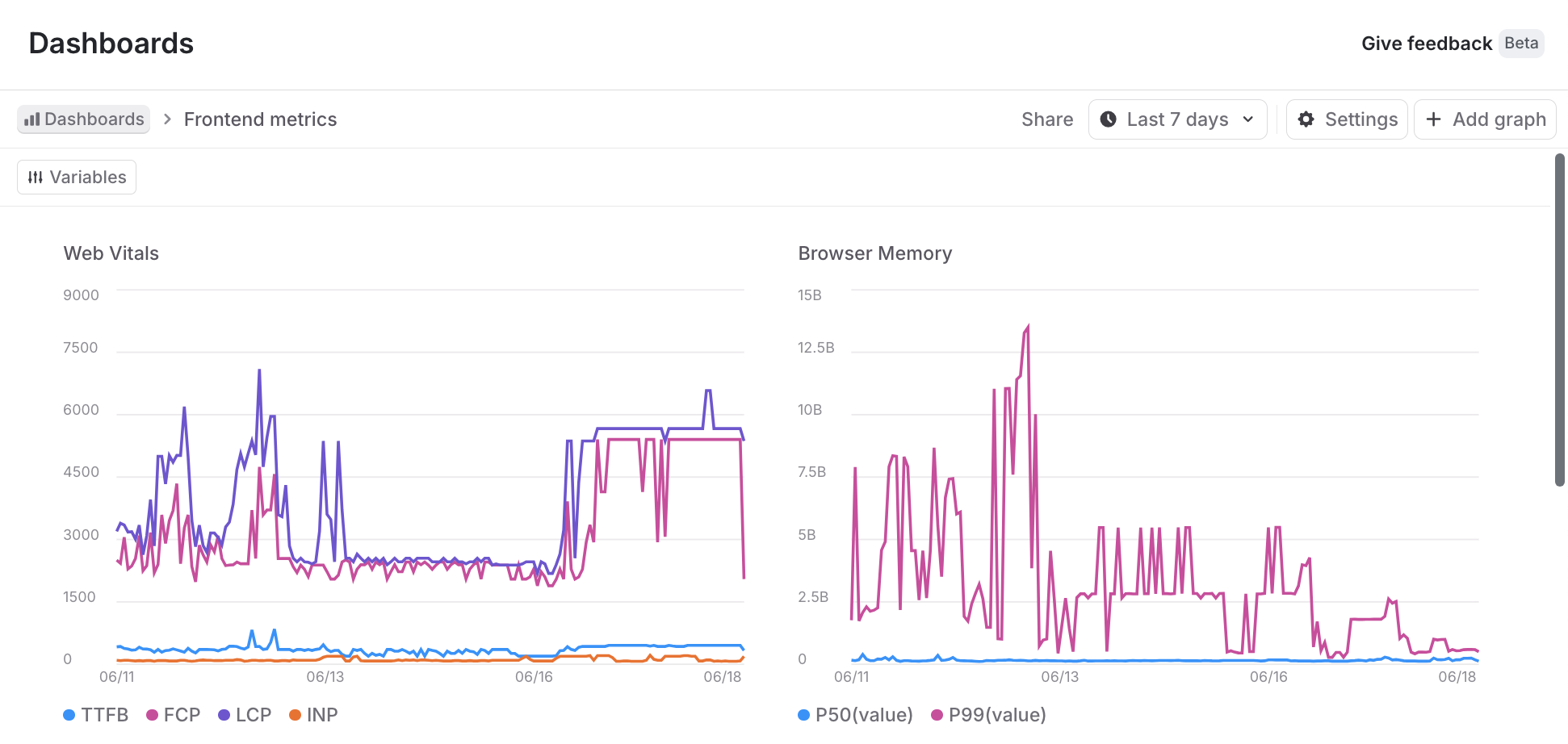
Dashboards let you visualize what’s happening in your app. They can show error rates, APM trends, user engagement, and more. Dashboards are composed of graphs, which are visualizations of data that you can create and configure to show the data you want.
LaunchDarkly provides two types of dashboards:
- Default dashboards: Pre-configured dashboards that provide immediate visibility into frontend, backend, and LLM application performance. You cannot edit, create, or delete default dashboards, but they automatically populate with data when you have the required integrations.
- Custom dashboards: Fully customizable dashboards that you can create, edit, and delete to meet your specific reporting needs. To learn more, read Creating custom dashboards.
To visualize service-to-service dependencies derived from your traces data, read Service map.
Default dashboards
Default dashboards provide out-of-the-box observability for your applications without any configuration. To access default dashboards, navigate to Observability > Dashboards in the LaunchDarkly UI. The default dashboards will appear automatically once you have the required integrations configured and data is flowing.
There are three default dashboards available:
Frontend default dashboard
The frontend default dashboard monitors client-side application performance and user experience metrics. This dashboard includes three tabs:
Backend default dashboard
The backend default dashboard monitors server-side application performance, including API endpoints and database queries. This dashboard includes two tabs:
LLM Agent default dashboard
The LLM Agent default dashboard monitors the performance and usage of large language model (LLM) calls in your application. This dashboard requires traces with gen_ai.* semantic convention attributes, such as gen_ai.operation.name, gen_ai.request.model, and gen_ai.usage.input_tokens.
Server-side SDK or OpenTelemetry traces with gen_ai.* semantic convention attributes. To learn more, read Observability SDKs.
The dashboard displays:
- Token usage over time, broken down by input and output tokens
- LLM call rate and error rate
- Latency metrics, including average and P95
- A models table showing model name, provider, call count, token usage, duration, and error rate. Clicking a row opens Related Resources filtered to that model.
- A tools table showing tool name, execution count, duration, and error rate. Clicking a row opens Related Resources filtered to that tool.
View graph details
For each graph, you can always take a closer look at the underlying data. Here’s how:
-
Click Dashboards in the left sidebar.
-
Find the dashboard you want to update and click its name.
-
Find the graph you want to examine and hover over its graphed data. A tooltip of the current datapoints appears.
-
Click to freeze the tooltip and show links to the details for each data point:
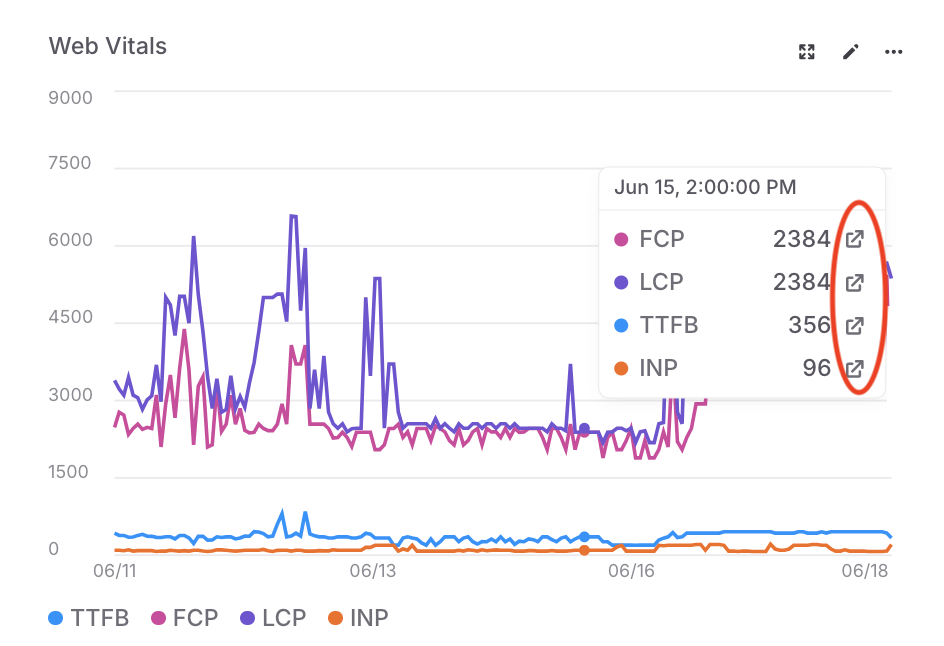
A graph on a dashboard. The tooltip displays information on the current datapoints, and the details links are called out. -
Click any of the details links to open a panel with the relevant sessions, errors, logs, or traces. The data points in the panel are filtered using the graph’s filters and the grouping, time range, or metric bucket for the specific data point that you selected.
From the detail panel, you can:
- Search the underlying data using the search specification for the LaunchDarkly observability features.
- Click Copy link and share the data with other members of your organization.
- Click a data row to review additional details.
Viewing flag targeting changes
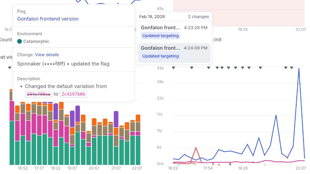
You can overlay flag targeting changes on dashboard charts to correlate feature flag updates with changes in your application metrics. This is available on both default and custom dashboards.
To view flag targeting changes, select one or more flags using the Flags dropdown in the dashboard filter bar. Then select one or more environments using the Environments dropdown.
When enabled, markers appear on the time axis of each chart at the timestamp of each flat targeting change. If a flag has progressive rollout steps, the steps are connected with a line.
Hovering over a marker displays a tooltip with details about the change. Click View details in the tooltip to open the flag’s targeting history.