Creating custom dashboards
Custom dashboards are fully customizable visualization tools that you can create, edit, and delete to meet your specific reporting needs. Unlike default dashboards, you have full control over the graphs, layout, and configuration of custom dashboards.
Creating a custom dashboard
Here’s how to create a custom dashboard:
- Open the Telemetry section and navigate to the Dashboards list.
- Click Create new dashboard.
- Give your dashboard a human-readable Name.
- Click the dropdown to choose the Dashboard type:
- A Blank dashboard is initially empty. To add graphs, read Adding graphs to a custom dashboard procedure, below, to populate it.
- A Frontend metrics dashboard is configured to include graphs for web vitals, browser memory, HTTP response size, HTTP request size, HTTP errors, and HTTP request latency.
- Click Create.
The new dashboard appears. For each Dashboard type, you can customize or remove graphs, and add additional graphs, to meet your reporting needs.
Adding graphs to a custom dashboard
You can add graphs to a dashboard to visualize data in different ways. LaunchDarkly provides the following observability graph types:
Read the sections below to learn how to create each graph type.
Creating a time series graph
A time series graph displays the value of selected data points at fixed time intervals. Time series graphs are common visual tools to help you monitor trends or fluctuations of key measurements over time.
For example, the default dashboards use time series graphs to help you monitor the number of page loads, errors, severe log messages, and latency values in your applications.
To create a time series graph you choose visual aspects of the graph display, then configure the resources you want to monitor. Here’s how:
- In a custom dashboard, click + Add graph to display the graph configuration panel.
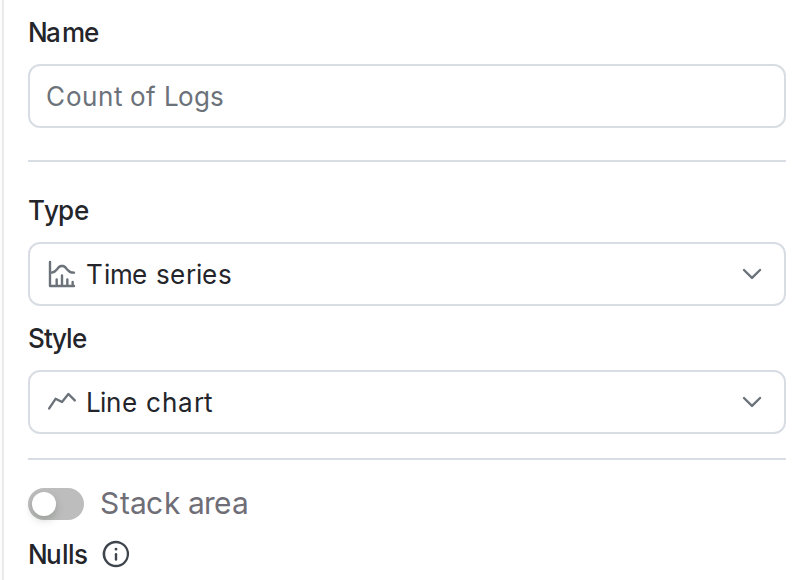
- Give your graph a human-readable Name.
- Choose “Time series” from the Type drop-down menu.
- Choose an option from the Style menu to configure how the graph displays data:
- “Line chart” (the default) uses a continuous line to indicate the change in values over time.
- “Bar chart / histogram” uses a vertical bar to show the relative change in values over time.
- “Table” shows the numerical values at each timestamp.
- (Optional) Select how to stack visualizations, which lets you compare amounts from multiple sources.
- For line charts, toggle Stack area on to display multiple areas stacked on top of each other.
- For bar charts, toggle Stack bars on to display multiple bars stacked on top of each other.
- (Optional) Specify how to handle Nulls or empty values. For line charts, nulls can be graphed as hidden, connected, or zero. For tables, nulls can be displayed as hidden, blank, or zero.
- Hidden means nulls are not displayed.
- Connected means if two non-empty values have empty or null values between them, the two non-empty values are graphed with a connecting line.
- Blank means nulls are displayed as blank rows in a table.
- Zero means nulls or empty values are displayed as having a zero value.
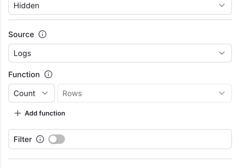
- Choose a Source from the dropdown. You can populate each graph with data from any of the following:
- Logs
- Traces
- Sessions
- Errors
- Events
- Observability metrics
- (Optional) Select a Function from the dropdown to determine how data points are aggregated. “Count” is selected by default. If you choose a function, such as “Min,” that requires a parameter, select the attribute to use as well.
- (Optional) To add an additional function, click + Add function.
- (Optional) Toggle Filter on to select which data points to include in your graph. For example, if you only want to include data from the production environment, set the
environmentfilter. To learn more about the filter syntax, read Search specification.
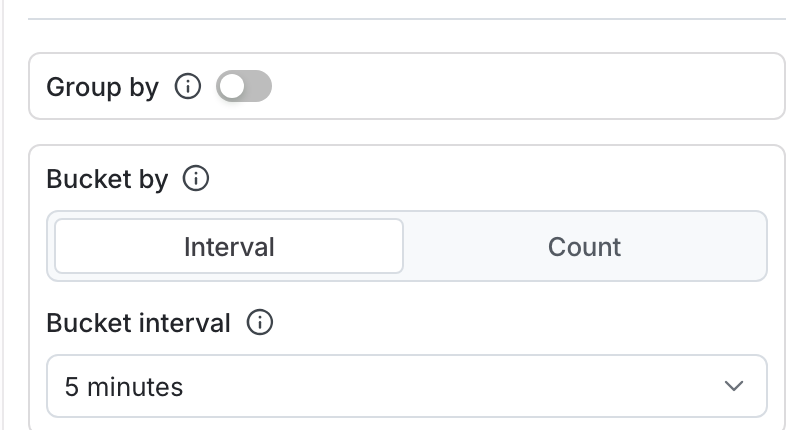
- (Optional) Toggle Group by on to group your query results into separate series. Use the dropdown to choose the category by which to group results. For example, you might group your logs by severity level.
- (Optional) Specify a Limit to restrict the number of groups displayed, and a function type to determine whether a group should be included in the graph.
- (Optional) Toggle Bucket by to Interval or Count to indicate how bucket sizes should be determined.
- Bucketing by interval requires that you set a Bucket interval. A higher time interval displays more granular buckets.
- Bucketing by count requires that you set the Time buckets value to the number of buckets to display on the x-axis.
- Click Save. The new graph appears in the dashboard.
Creating a categorical graph
A categorical graph shows discrete values of a measurement across different categories. Categorical graphs typically use bar charts to visually show the value of each category compared to others, with the higher values appearing first in the series.
Use categorical graphs any time you want to compare a given measurement across some category that produces the measurement, for example to display the number of recorded errors by service name over a fixed period of time.
To create a time categorical graph you choose the resources you want to measure and the categories to use for grouping items in the series. Here’s how:
- In a custom dashboard, click + Add graph to display the graph configuration panel.
- Give your graph a human-readable Name.
- Choose “Categorical” from the Type drop-down menu.
- Choose an option from the Style menu to configure how the graph displays data:
- “Bar chart / histogram” (the default) uses a vertical bar for each category to show the value of each category across the x-axis of the graph.
- “Line chart” uses a single vertical line with entries to show the relative values of different categories.
- “Table” shows the numerical values of each category.
- (Optional) Select how to stack visualizations, which lets you compare measurements from multiple categories.
- For bar charts, toggle Stack bars on to display multiple bars stacked on top of each other.
- For line charts, toggle Stack area on to display multiple areas stacked on top of each other.
- Choose a Source from the dropdown. You can populate each graph with data from any of the following:
- Logs
- Traces
- Sessions
- Errors
- Events
- Observability metrics
- (Optional) Select a Function from the dropdown to determine how data points are aggregated. “Count” is selected by default. If you choose a function, such as “Min,” that requires a parameter, select the attribute to use as well.
- (Optional) To add an additional function, click + Add function.
- (Optional) Toggle Filter on to select which data points to include in your graph. For example, if you only want to include data from the production environment, set the
environmentfilter. To learn more about the filter syntax, read Search specification. - (Optional) Toggle Group by on to group your query results into separate series. Use the dropdown to choose the category by which to group results. For example, you might group your logs by level.
- (Optional) Specify a Limit to restrict the number of categories displayed, and a function type to determine whether a group should be included in the graph.
- Choose the Category field that provides the value you want to aggregate results for each category.
- Specify the maximum number of category entries to display in the Category count field.
- Click Save. The new graph appears in the dashboard.
Creating a funnel graph
A funnel graph displays the percentage of unique contexts that are measured at different different steps of a process, typically from steps that represent a marketing funnel. Funnel graphs typically show a reduction in the percentage of unique contexts at each stage of the funnel, with the final stage representing a successful conversion event, such as a subscription or a completed purchase.
For example, you might create a funnel graph that displays the percentage of unique user contexts that generate events at each of these steps:
- Visiting a sale page.
- Clicking an “Add to cart” button to create or update a shopping cart.
- Completing a purchase.
- Choosing an option to join a loyalty club or agree to marketing correspondence.
Funnel graphs use product analytics events as the source measurement for each step of the funnel. To learn more, read Product analytics events.
To create a funnel graph you choose the events to measure at each step of the funnel, then select a context kind to monitor through the funnel. Here’s how:
- In a custom dashboard, click + Add graph to display the graph configuration panel.
- Give your graph a human-readable Name.
- Choose “Funnel” from the Type drop-down menu.
- In the Compare to menu, choose how to calculate the percentage of unique contexts at each step of the funnel:
- “Previous step” (the default) calculates the percentage in comparison to the previous step of the funnel.
- “First step” calculates the percentage in comparison to the very first step of the funnel.
- Click the Step 1 drop-down menu to select the product analytic event you want to measure at the first step of the funnel. Use the filtering buttons to show available events, then choose one event to measure:
- All shows all available product analytics events.
- Track shows events that occur when your code uses the
track()method to generate a custom LaunchDarkly metric event. - Click shows click events that occur at a configured URL.
- Page view shows events when a user loads a specific page of your application.
- Click + Add step and select the event to measure for the next step of your funnel. Continue adding steps as necessary to fully describe the marketing funnel you want to display.
- (Optional) Toggle Filters on to configure a filter that applies to all events in the funnel steps. You can also configure filters for individual steps by clicking Add filter next to the step configuration.
- Choose one or more Context keys to measure unique contexts that generate the event at each step of the funnel.
- Click Save. The new graph appears in the dashboard.
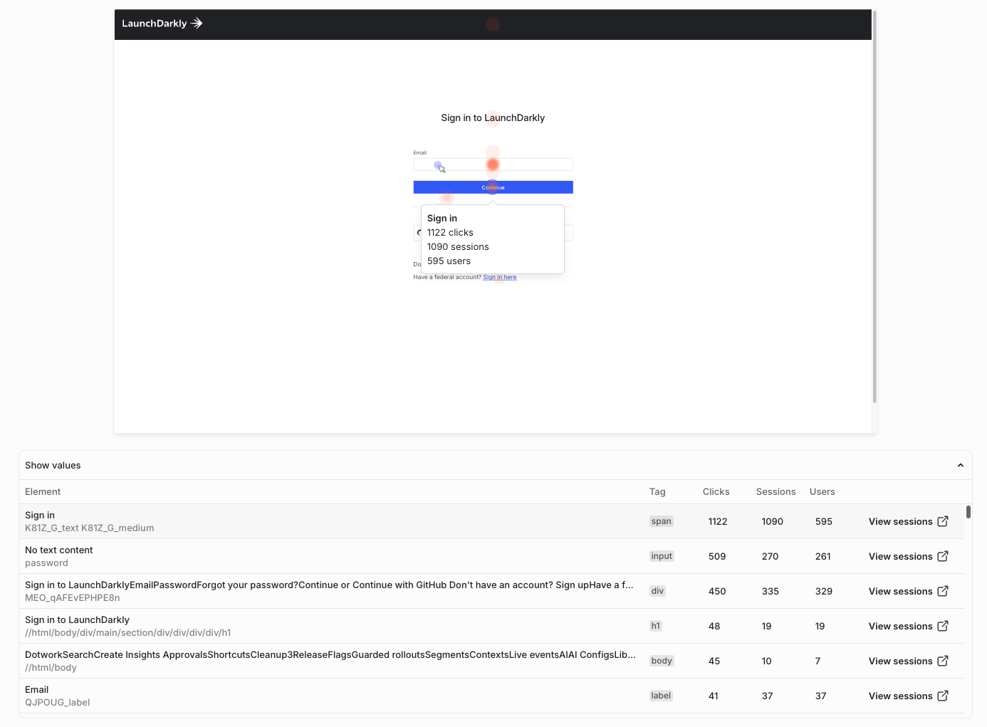
Creating a heat map
A heat map is a map of clicks shown over a session background. A heat map provides a visual layer that aggregates user interactions such as clicks, taps, or scrolls into color-coded intensity maps over your app or website.
Session backgrounds
You can create a session background for your app or website while watching a session.
Heat maps help teams understand user behavior across key areas of an application. Use them to identify where users most often click or tap on critical workflows, and to find elements that appear interactive but receive little user engagement. Product, engineering, and design teams can use heat maps to validate the impact of design or layout changes after a release, and to correlate engagement data with feature flags to measure how user interactions change before and after a rollout.
Prerequisites
To use a heat map, you must install and configure the session replay plugin to capture user sessions. Heat maps are available only with web sessions.
Procedure
To create a heat map:
- In a custom dashboard, click + Add graph to display the graph configuration panel.
- Give your graph a human-readable Name.
- Choose “Heat map” from the Type drop-down menu.
- Select a URL Path, which is the URL of the page you want to visualize (for example, your application homepage or a specific product page).
- (Optional) Add Filters to narrow the sessions that appear in the heat map. For example, you might choose to select sessions by environment, device, or browser size. Toggle Session background locked on if you want to keep the current background in place as you add or change filters.
- Click Save. The heat map appears in the dashboard with the session background and click overlay for the selected path.
Interpreting a heat map
The heat map overlay can identify several types of activity:
- Hot zones (red/orange) indicate areas of frequent interactions or high user engagement.
- Cool zones (blue) indicate underutilized areas or areas with low user engagement.
- Scroll maps visualize how far users typically scroll before disengaging with the page.
Hovering over a zone in the overlay also displays the element name with a numerical count of interactions for the element.
Advanced graph creation tools
The graph editor provides two advanced graph creation tools: the SQL Editor, which you can use to query data for your graph, and dashboard variables, which you can use to parameterize graphs.
SQL Editor
The SQL editor lets you write custom queries to retrieve your data and aggregate as you wish. Using the SQL editor is an alternative to using the graphical query builder.
Expand Use SQL Editor to retrieve graph data
When you are creating or updating a graph for your dashboard, you can choose SQL editor to write a custom query with SQL.
The SQL editor includes the following features and limitations:
-
The SQL editor supports the ClickHouse SQL dialect. To learn more, read the ClickHouse documentation.
-
The built-in macro
$time_interval(<duration>)expands totoStartOfInterval(Timestamp, <duration>). You can use this macro to group results by their timestamp, which makes time series queries easier to write. Here’s an example that returns a count of logs for every hour:Example using $time_interval macro -
The dashboard’s data range is automatically applied as a filter to all SQL queries. For example, if your graph uses
SELECT count() from logsand your dashboard’s filter isLast 4 hours, your resulting graph will only include logs within the last four hours. If you use aWHEREclause, it will filter in addition to the dashboard’s date range filter, and it will not include results outside that range. -
The SQL editor only supports a single
SELECTquery. However, you can include multiple select expressions. This displays multiple series on your graph. Here’s an example that returns an hourly count and average duration of all traces:Example querying multiple series -
LaunchDarkly stores custom fields and metadata without any type information. You should convert this data to the appropriate type in your SQL queries. Here’s an example where your application records a custom integer field to record how many items are in an end user’s shopping cart:
Example applying type conversion -
You can use aliases in your SQL queries so that your data is graphed with custom labels. Here’s an example:
Example using alias to create custom labels
Dashboard variables
Dashboard variables let you parameterize filters, bucketing, and grouping across multiple graphs. This makes it easier to make changes to sets of graphs at one time. After you create a dashboard variable, you can reference it in any of the filter, function, grouping, or bucketing rules components of the graph editor.
Expand Use dashboard variables in your graphs
You can create and edit dashboard variables from the dashboard or from the edit page for any graph.
Here’s how:
-
From the dashboard or the edit page of a graph, click Variables. The “Variables” dialog appears.
-
Click + New variable.
-
Enter a Name for the variable.
-
Select a Suggestion type for the variable. The following table describes the options:
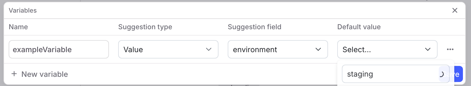
The "Variables" dialog, with a new variable filled in. -
Click Save.
-
In any of the filter, function, grouping, or bucketing rules components of the graph editor, reference your variable by entering a dollar (
$) followed by the variable’s Name, for example,$environmentor$emailAddress.
Managing custom dashboards
After you create a custom dashboard, you can review, update, and share it.
Share a custom dashboard
To share a custom dashboard, click Dashboards in the left navigation. Find the dashboard you want to update and click its name. From here, you can share the dashboard’s data in the following ways:
- To share a link to the dashboard, click Share. The URL for the dashboard is copied to your clipboard.
- To share the data behind a particular graph, find the graph and hover over its name. Click the overflow menu and choose “Download CSV.”
Update a custom dashboard
To update a custom dashboard, click Dashboards in the left navigation. Find the dashboard you want to update and click its name. From here, you can make the following updates:
- To update the dashboard’s name or default time range, click Settings. Make the changes in the “Dashboard settings” dialog. Then click Save.
- To add a new graph, follow the Add graphs to a custom dashboard procedure, above.
- To clone an existing graph, find the graph you want to clone and hover over its name. Click the overflow menu and choose “Clone graph.”
- To remove a graph, find the graph you want to remove and hover over its name. Click the overflow menu and choose “Delete graph.”
- To update a graph, find the graph you want to update and hover over its name. Click the pencil icon to edit the graph. For more information on the fields you can change in the graph setup, read the Add graphs to a custom dashboard procedure, above.
Delete a custom dashboard
To delete a custom dashboard:
- Click Dashboards in the left navigation.
- Find the dashboard you want to delete.
- Click the overflow menu.
- Select Delete dashboard.
Deleted custom dashboards cannot be restored.
Deleted custom dashboards cannot be recovered
If you delete a custom dashboard, you cannot restore it. Be absolutely certain you do not need the dashboard before you delete it.